New Guide to Coloring – Media

Image


New Guide to Coloring

“New Guide to Coloring for Crafts, Adult Coloring Books, and Other Coloristas!” by the editors of Do Magazine, Design Originals an imprint by Fox Chapel Publishing, ISBN 978-1497200876, $11.19 or 14,95€

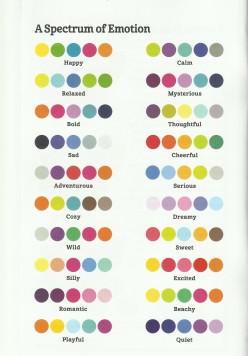
This book will teach you everything you need to know about coloring such as layering, shading, blending, patterning, and other techniques. Coloring has become more complex and more fun, but it has also developed into a new therapy method for stressed-release.

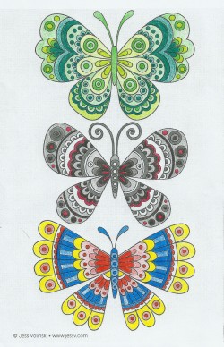
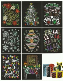
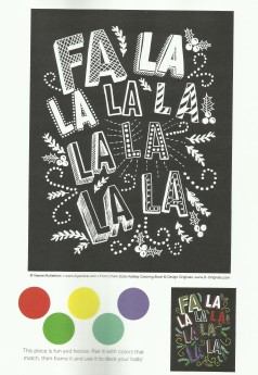
The “New Guide to Coloring” makes it easy for you to learn the different techniques with helpful practice areas and many illustrations for demonstration. There are a number of pages with patterns for you to color and try out.

Over the next months, I will introduce you to three lessons from the book that will definitely make you want to buy a coloring book and get crackin’! The first lesson will sum up the most important rules for the use of the most frequently used media.

It’s all in the pen(s)
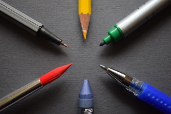
tip sizes

tip sizes

There is an incredible variety of pens to color with. However, you need to consider certain factors before you start coloring a picture. How do I want the result of my picture to look like? Am I working with more than one media? And so on…

The number one general rule is to color with the pens you feel most comfortable with. Once you are ready to try more, you can experiment with other media.
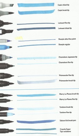
Markers

#1 Adjust the tip-size to the size of the area you are coloring. A small area requires a small tip to stay in the lines, larger areas are filled much faster with a large tip.

#2 Keep a safe distance to the lines to give the ink space to bleed out. Otherwise it will look like you had trouble staying inside the lines.

#3 Too many layers of a water-based marker can damage your paper, so the less layering, the better.

Colored Pencils

#1 Take good care of your pencils. If they fall too often or they are handled roughly when transported, they can break easily while coloring or sharpening.

#2 Kneaded erasers are best to use for colored pencils. Usually, the colors are hard to erase in general, so do not apply the colors with too much pressure if you are not 100% certain about your choice of color.

#3 With wax-based pencils, fixate your result with hairspray to avoid wax bloom (Wax bloom is a white shade that develops over time from the wax that holds together the colored pigments of the pencils; if this happens, you can use a cotton wool to wipe it off).

Watercolor Pencils

#1 Do not use too much water or

a) you will ruin the paper and

b) the color will fade and won’t have the intended effect you wished for.

#2 Practice the appliance of the water before you actually use it on a picture.

Gel Pens

#1 Let the ink dry long enough or the color will smudge.

#2 Test the colors before you apply them. Some colors might not be visible on the color you are using it on, therefore you have to plan the combination of your colors beforehand. Try them on an extra sheet of paper.

A little hint: white goes with almost everything, white patterns on a colored picture look!

dsc_0059

pens pens pens

There are many more options of media for you to pick from, but there are a few you might not think of…Try eye shadow, for example, coffee or tea (they will also give your picture a great smell!), or nail polish!

Have fun figuring out new combinations of media! I think I am gonna get my nail polish and try that one… I am just too curious!

If you want to learn more, check out  “New Guide to Coloring”  for more detail and further lessons or check out the next lesson on pen.paper.polkadots coming soon.

Daphne’s Diary 2017- a colorful agenda

Image

Daphne's Dairy 2017

Daphne’s Diary 2017

May I introduce you to the „best agenda for 2017“—and it’s true! Daphne’s Diary is a lovely detailed agenda. Playful and romantic themes in a vintage look make it your colorful companion for 2017. But you might ask yourself: who actually is Daphne?

Daphne lives in the Netherlands and turned her diary-entries into a magazine that is published in several languages all over the world. From crafts to recipes and garden-tips, everything can be found in Daphne’s world. She uses mostly nature-based products such as flowers or wood, and a lot of color and patterns.

The agenda dresses up the usually boring pages in amazing pictures that change weekly and adapt to the seasons. It has enough space for notes and lists and, additionally, entails stickers and cards. Recipes make you want to try them right away and crafts-ideas inspire you to start new projects. I love the motivating sayings appearing at the start of every month. My personal favorite: „Eat less sugar, you’re sweet enough!“. If you hang that one on your fridge, your diet will be a piece of cake 😉

The general structure of a weekly view is nicely explained with comments, because there are some special features that are rather unusual for agendas: a mood-o-meter, water bottles and fruits to check your daily intake, as well as a line for planning your vespertine tv-program. Everything is taken care of….well, almost, because one thing is missing: a space to note addresses and phone numbers. Although it is nearly unnecessary to write down phones numbers in today’s smartphone-universe, it might be helpful to have the most important numbers handy in case technology fails you. Daphne’s Diary is quite big and heavy, so it is even more uncomfortable to carry an extra address book. Still, you will find a space to write them down, even if there is no separate address-category.

beautiful artwork

beautiful artwork

As I said, the book is a little heavy, which is why it is almost better and more decorative on your counter at home than in your handbag. Nevertheless, that doesn’t stop the calendar from bringing you joy and inspires you to live out your own creativity. It’s almost a pity that there is no week left to design yourself. The (slightly too corny) coloring pictures are not enough to fill that need. But, it is so much fun to peruse the agenda and discover new patterns and themes every week.

There is a short video displaying the agenda on Daphne’s homepage, go check it out for more insight: https://www.daphnesdiary.com/movies/

Daphne’s Diary makes planning more fun and gives your year the dose of corny it needs. For me, it was love at first sight and I can’t stop browsing in the agenda. It makes a great gift for a friend, your mom, or, better yet, for yourself!

Wrapping-up crafts

Image

stars and candy canes

stars and candy canes

Hey there!

Christmas is almost here and you should to get going on wrapping your presents. I have prepared some ideas for you to mix it up a little.

If you are using printed paper, it is not necessary to put extra decorations on the present. In that case, a simple ribbon will do, otherwise it would be too flamboyant.

With single-colored paper there are countless options. How about some stars or candy cane-hearts?!

I found this double-sided wrapping paper, which makes any additional materials unnecessary…

double-sided wrapping paper

double-sided wrapping paper

Just fold the end in the middle of the item and wrap it all around to the back. Make sure the sides are even before you cut out the half of a tree in the folded side. Use the same pattern to create the counterpart with extra paper in the opposite color. You can also cut out the tree entirely, instead of cutting one half out of the paper and gluing the other one on. This technique works with stars or any other Christmas-themed patterns as well!

Lately, themed tape has been very in-style. I think it looks festive when you want to spruce up simple brown paper. Stickers are also a great alternative…

themed-tape and sticker wrappings

themed-tape and sticker wrappings

Ok, I admit—every now and then you need to put ribbons on a present and I combined them with ornament decorations…

Christmas ornament decorations

Christmas ornament decorations

I hope you can use some of my ideas to inspire your wrappings. Have fun crafting!

self-made X-mas cards

Image

folded Christmas cards

folded Christmas cards

Today, I want to show you some ideas for self-made Christmas cards in the form of postcards and folded cards. There are no step-by-step instructions because I think the designs are easy enough to be self-explanatory. My creations should motivate and inspire you to get started on your own project. Before you get crafting, draw sketches of the visions of your cards. This way you won’t forget anything and you can change little details if you need to.

There are so many ways to design your cards: you can paint on patterns and whishes on paper, craft patterns to decorate the cards with, and I used Christmas-themed paper and ribbons. I prefer the traditional Christmas colors red, white, and green, but you can use any color you like.

img_3851

polka dot tree

I made all the patterns myself by drawing the outline of the card on quad paper and fit the pattern on the card. To get the size of the card just right, I used standard postcards as patterns.

Let’s start with one of the easiest designs: a simple triangle polka dot tree. To add a bit more excitement, I encircled the tree with a black line and glued on a star on top of the tree. The multicolored polka dots make it seem like the tree is decorated. Also, the inside of the card is red.

trees trees trees card

trees trees trees card

The trees trees trees card is my very own design of crafting cards. I used scissors that cut a great pattern into the edge of the upper corner and the same scissors to cut the themed paper on the inside of the card. The pattern is also repeated on the front of the card. You could substitute the middle-strip of trees for a Christmas-whish or little cut-out trees instead.

squad tree

squad tree

This last folded card is my absolute favorite. I decided to add the frame after I made the tree, because there was something missing. The square pattern has natural lines that I used to create the frames and edges of the tree.

As you can see, none of these cards have writing on them, which gives them a cleaner and more elegant look. But with postcards, it’s totally different…

There is no Christmas without ribbons, but why should they always be on the presents?

These next two postcards have ribbons as a great 3D-look. I fastened the ribbons with hot glue. Note: Fabric-ribbons tend to dissolve on the ends once you cut them. To avoid that, attach double-sided tape on the back of the ribbon BEFORE you cut it in shape.

plaid Xmas

plaid Xmas

See you next time on pen.paper.polkadots for new ways to wrap and decorate Christmas presents!

polka dot Christmas

polka dot Christmas

Butterfly Mobile for Babies

butterfly mobile

butterfly mobile

This mobile is the perfect present for births, christenings or other occasions involving babies or small children. Usually it is hard to find the right gifts, not knowing the tastes of the parents or not knowing what they already own… with a self-made present there is no possibility of failure! The amazing thing is, you need very little materials to craft this beauty.

img_3788

materials

Material:

  • Mobile-set
  • Sheet of themed paper
  • Different kinds of ribbons /wool /thread
  • Sparkling tape (you can also get sparkling paper and glue both of the sheets together, this even makes the butterflies more solid)
  • Beads

Instructions:

1.Attaching the ribbon to the mobile-set

To make the wooden sticks more colorful, wrap a ribbon around each stick. Fasten the ribbons with a hot glue to keep them from sliding off when you attach the middle and outer wooden ends. Make sure to always wrap the ribbon in the same direction and with the same intervals, or alternate them for consistency.

2.Fashioning the butterflies

Hint: Fashion more butterflies than you need, just in case. When it’s time to balance them on the thread you probably need a few test-runs.

img_3819

butterflies close-up

3.Preparing the wool/thread

Cut the number of strings you need, depending on how many butterflies you are using. I used 12 butterflies, two to each stick (a small and a big one). Sewing thread would be a great alternative to wool since it is less visible. Fold the wool/thread into a loop and use a needle to thread the wool under the ribbon, in case you have trouble sliding it under. If you are using thinner thread it might even suffice to fasten the thread on top of the ribbon. That depends on your taste and vision of the mobile. Once secured on the stick, pull the other end through the loop and twist both ends of the thread.

4.Hanging up the butterflies

Thread a bead and a butterfly on each string. With my butterflies, it was best to place the needle 0.2 inches (5mm) from the upper middle edge. The bead will weight down the butterfly, so it looks better hanging. Do not fasten the thread underneath the butterfly yet. Once all the butterflies are on the mobile you might want to change some of the heights… I also added a butterfly in the middle of the mobile, using the same ribbon that is wrapped around the wooden sticks. This gives it a playful and more colorful look.

Watch out! Make sure to secure the beads so they cannot fall off and be swallowed by the baby. If you are using a bead above the butterfly and fasten the thread with a double knot at the end, it should be fine. The parents should hang up the mobile out of reach of their children.

mobile

mobile

5.Finishing up

Level the butterflies the way you like them best and tie up the ends of the threads right underneath each butterfly. Make sure the knots are secure before you cut off the surplus thread. Do not forget to save some ribbon to fashion a bow for hanging up the mobile.

You can bend the butterflies in the middle to make them look like they are flying.

I love this mobile and I almost kept it myself 😉 I hope you like it as much as I do and this creation will soon decorate the bedroom of a baby out there. It is a super easy present to craft and it doesn’t even take that long! Give it a try and send me your results…

Happy first Advent-weekend!

Image

img_3808

my advent decorations

Happy first advent-weekend, everyone!

Just thought I’d share with you my creation for this year’s advent-time. I hope you all have dug out your Christmas decorations and went all over the place! There can’t be too much red at this time of year.

Enjoy this magical time and keep up the crafts.

Up next on the blog:

A mobile for babies. Great gift for occasions such as birth, Christening, or any other occasion….


“How to Color” – the Color Circle

Image

Hi there coloring-friend!

This is the first part of my series on “How to color”. The section will introduce you to different techniques that will make your drawings unique and your coloring experience more fun. The new trend for adult coloring books has shown that it is not just a great way to occupy children with. Grown-ups can just as easily escape in the world of colors. It has a meditative effect because you focus on your picture and staying in the lines that takes over your thoughts of every-day chores.

FYI, copy the picture you want to color in so you can reuse it or give it to someone for a present. This way you will keep your coloring book clean to copy it as often as you like. If you are more advanced and you want the book to be your own works of art, then go ahead – but, here is a little challenge for you: copy one picture three times and color it using different colors (and optionally different materials). Do not use a color more than once in all of the three pictures. The result will make a great trilogy!

If you are a first-timer and want to get coloring, just sit down with your favorite pencils and don’t let any rules stop you. But, if you want to give your picture a special design, you can learn techniques such as layering, shading, and mixing colors for more variety.

coloring-sample-3

colored samples

To challenge the mere aspect of coloring, you have to think in advance about the colors you want to use. When the picture you chose has many small elements, I would suggest using not more than three colors. Even though the areas are meant to be colored, you can leave a few of them white to take out the excitement of too much color, especially with highly contrasting ones (see sample, third butterfly). Also, don’t be afraid to use achromatic colors such as black or grey. By adding just one color to the mix it will stand out even more. It doesn’t always have to be all-color to make a picture interesting, as the second butterfly in my example illustrates. Black, white, and grey pictures can look very elegant, too. The first butterfly of the example shows that white can be expendable when you are using lighter shades in a group of colors that harmonize greatly to create contrast. For all of the examples I used only three pencils, but by varying the pressure of the pen on paper I was able to create more shades of each color.

To get you in the mood for learning more about coloring and the use of colors let me introduce you to the color circle!

The Color Circle

color-palette-emotions

colors and emotions

Every person has a different perception of colors. While some might think of red as aggressive and negative, others (like me) perceive it as warm and comforting. The Design Originals “Color Animals Coloring Book” features a color pallet called “A Spectrum of Emotion”, which shows that certain colors express certain feelings. Take a look at the picture and see if you think the same about the combinations. Feeling should also decide about the colors you want to use for your pictures, but there is a kind of doctrine for artists on the harmonies of colors. The color circle is a great help to find matching colors and find out how to mix colors to create new ones. Here are the basics of color theory:


The facts:

  • Primary colors: red, yellow and blue (they cannot be mixed from other colors on the circle)
  • Secondary colors are mixed from the primary colors: orange (red + yellow), green (yellow + blue), and violet (blue + red)

    dsc_0014

    color circle (front)

  • Warm colors range from red-violet to yellow
  • Cold colors from violet to yellow-green
  • Complementary colors are opposite each other on the color circle, they are highly contrasting when used together and they can be mixed to create different shades.

There are million different shades of colors, but the primary colors are the basis to all of them. Black and white can be used to create different shades of one color, but they also create depth, a 3D-effect. As mentioned in the facts above, complementary colors can be used to create shades as well, this way the color will remain brighter. Black and white make colors fade, therefore you have to decide yourself which effect you want in the result of your picture.

dsc_0016

color circle (back)

The triad marks three colors with the largest distance possible on the color circle. The primary colors, for example, are separated by three colors in-between, which means they have a high contrast to each other. The smaller a distance between two colors the better they harmonize.

If you want to use the color circle online you can find many different options that you can print out or use on your computer, for example the simple version by Johannes Itten. There is also a great version you can get online or at craft-stores that have resolvable layers to show you the results of mixes and relations between the colors. You do not have to use the circle, but it can help create great combinations to reach the best contrasts in your pictures.

Until the next “How to Color” article, get a sheet of white paper and try to play with the intensity of your colors by varying the pressure of the pen on paper and see what happens. Get comfortable using the color circle if you have trouble knowing which colors match.

The Chalk-Style Holiday Coloring Book – Review

Image

chalk-style-holiday

“Chalk-Style Holiday Coloring Book” by Valerie MCKeehan, Design Originals an imprint by Fox Chapel Publishing, ISBN 978-1-4972-0164-4, $9,99 or 6,99€

The “Chalk Style Holiday Coloring Book” caught my attention because I hadn’t seen coloring books with a black background before. The colors are so much brighter this way.

holiday-sample-3

Valerie’s colored samples

The book starts out with an introduction of the author, handletterer and chalk-style artist Valerie McKeehan. She gives a short insight into her work how she transfers her pencil sketches on the chalk board and digitalizing them to add color on her computer. Valerie includes many of her colored examples to inspire her audience.

Tips and tricks on coloring in chalk-style art help you to get the best effect for your picture. Valerie suggests using gel-pens to add your own design on the black background. I would also use a white pen to create extra (snow) decorations. Gold and silver pens add a festive touch to it. She also uses layering and shading to create 3D-effects in the drawings. To learn more about these techniques, stay tuned for my series “How to Color”.

The individually detachable pages are made of acid-free paper under fair-trade principles. Each page has a quote on the back and space to include a personal message.

In a section called “Color Theory” Valerie serves you with basic ideas of combining and mixing colors. Here she says to use black and white to create shades and tints, but I would rather advise you to use complementary colors on the color circle. If you use black or white the color might fade and lose its brightness with the black background. Try it and see which effect you like better. In case you need suggestions for color pallets, Valerie gives you a choice of colors and her fully colored picture on “super easy coloring pages”.

holiday-sample-2

super easy coloring page

Pencils suit the typical chalk-style best, even though the colors might need some layering to make them stand out more. Gel pens can create a great contrast to the black background and Valerie even recommends neon colors for highlights. The only disadvantage of some of the designs is that the drawings presuppose certain colors, because you would not normally color a Christmas tree blue or yellow. Hence, there are limited color options, if you want to make the pictures look authentic and realistic.

If you are a beginner and you still have trouble staying in the lines, this book makes it easy for you to practice, since the black background hides your mishaps better than white paper does.

Some of the designs feature a drawn recipe that will sweeten-up your holidays.

Since I love Christmas, I cannot get enough of this book! There are so many playful designs with wonderful lettering that get you in the Christmas mood. You can find the “Chalk-Style Holiday Coloring Book” by Design Originals on amazon.

In case you are looking for a non-Christmas item, there are various other themes available such as “Blessings”, “Simple Life”, “Nature”, and “Garden”.